Video captures courtesy of granadagreg, JokerCapt, CentralSouth5, shaunokeefe, JokerCapt, richiesherman, Halfbricktv2, azza5570, and matipionki
This article is about the TV idents. For the production logos, see Central Productions.
Background
Central Independent Television (more commonly known as Central, and nowadays known as ITV Central) was founded in 1980 after Associated Television re-branded itself to be more focused on its regional programming, as well as serving a separate East and West service for the Midlands. It officially launched in place of ATV on 1 January 1982, though it was pan-regional until 1983 due to a strike. Much like its former namesake, it provided massive support for national programming and even gained a international foothold through imports and Central Television Enterprises, founded in 1987. In January 1994, Carlton Communications fully bought out Central for £750 million and spent no time in reducing it in size, cumulating with it becoming known as Carlton Central on-air on 6 September 1999.
Logo: On a dark blue background, what appears to be a total eclipse of the sun is seen, "shining" along with edges of it. The "shine" disappears after a second and then the disc turns sideways, revealing it to be a light blue planet-like object. As the shadow gets halfway round, the globe opens up like an egg and a bright array of coloured lights burst out. A couple of seconds later, the two halves come back together, the lights go back inside, and the word "CENTRAL" in a white Erbar Neo Mini font appears below the globe, which now has a crescent-shaped shadow.
Trivia: This logo was designed by Minale Tattersfield, famous for designing Thames' logo.
Variants:
Sometimes, the moon closes in later.
On short news bulletins and before the main edition, the text would read "CENTRAL NEWS" instead.
Technique: Advanced early computer animation, likely done on an Oxberry animation stand.
Music/Sounds: A synthesised string arrangement with a "wah" effect. This is joined by a nine-note synthesised bell fanfare after two notes (chord F# sharp). The fanfare was composed by James Aldenham, The collaborative alias of Brian Bennett and Jim Stokoe, who later composed the ITV Schools theme for Channel 4 (UK). The fanfare was arranged by Mike Moran.
Music/Sounds Variants:
For the "CENTRAL NEWS" variant, an abridged version of the main theme would be used. On the debut programme, however, the music was the same as the normal logo.
On 1983 episodes of Family Fortunes, it's silent, or very heavily muted.
On Season 2 episodes of Bullseye, the music is low-toned which was to go with the pitch of the show's theme tune.
Availability: Rare. Logo buffs in the UK have preserved Central's logos, as they did with all the ITV companies.
This logo is preserved on most episodes of the 1983/84 season of Family Fortunes, as well as the second season of Bullseye on Challenge.
The first series of Blockbusters also used this logo, but it was removed when Challenge reran the series in the 2010s.
2nd Logo (1 January 1982-Autumn 1988)
Logo: On a black background, a shining circular outline fades in. A dark shadow slowly dissipates from the right side, revealing itself to be a white spherical object with a rainbow crescent. The word “CENTRAL”, in the same font as before, slowly fades in below the logo.
Variants:
A variant with "CENTRAL NEWS" would appear before the main local news prior to 1987, and also act as the titles for short bulletins prior to 1985.
On episodes of Family Fortunes (the UK's version of Family Feud) from 1987, it would zoom out and plaster itself onto the video screen used in the show as it segues to the intro.
On ATV programmes made before the changeover to Central, the text below the logo reads "CENTRAL PRESENTS". It either had no outline, a black background, and the text a bit off-looking, or a white outline, a blue background, and fixed-up text.
Sometimes, the white outline around the logo isn't present on the logo.
A special "pixelated" version exists. Here, the logo is on a space background, the text is in lavender, and a spaceship comes in from the right and swoops about and around the logo.
Some versions would be on a blue background.
Rarely, the company name below the rainbow crescent is black instead of white (which would give the letters some kind of physical distancing and or so spaced out as the company name hardly reads "C E N T R A L" splited into a breakaway style), the background is white instead of black, and the outline of the crescent is also black like the text from the latter.
A closedown variant also exists where it reads "GOOD NIGHT" which was used until 1985.
On 1987 episodes of Blockbusters, the logo fades into an image of the Earth of the show's aforementioned 1987 titles.
A possibly unknown variant exist where the 8th variant is used, instead the text now reads "CENTRAL PRESENTS" and fades to the last ATV UK logo.
Technique: More advanced computer effects for the time.
Music/Sounds: Same as the 1st logo.
Music/Sounds Variants:
A different abridged version of the Central News theme would play for the
Occasionally, this jingle could sometimes be played in 2 different chords other than F# originally, such as either in B major or D major (in an alternate).
On Season 3 of Bullseye, the jingle remains the same as the last logo, once again to keep the same pitch as the opening theme to the show. In Season 4 of Bullseye, the show's theme tune was changed, and so the logo went back to using the standard pitch.
On New Faces of '86/'87, the jingle was played by Harry Rabinowitz and his Orchestra.
The white background variant uses its special unique tune; the first half has its normal jingle playing (only the first 2 ones and the last note of the jingle), but later changes into a suspended theme (which notably sounds similar to a Mission Impossible soundtrack) nor this version is in a different chord from the original one.
Availability: Rare.
Used concurrently with the first one in 1982 before replacing it in November 1983.
Challenge has recently began airing episodes of Bullseye from 1983, with the low-tone variant of this logo playing before the opening credits on season 3 episodes, season 4 episodes retain the standard version.
Challenge broadcasts of most Family Fortunes episodes from the era should retain this logo as well.
3rd Logo (1985-1988)
Logo: On a black background, a simplified, 3D, cylindrical version of the symbol from the 2nd logo is seen, divided into twelve blocks. There are six coloured blocks (from above to below: red, orange, yellow, green, light blue and purple) to the left, which form a crescent shape, and six white ones to the right. Under the symbol is the word "CENTRAL" in the same font as before. There are many variants of the logo, the symbol of which flies around the screen in a similar fashion to Channel 4's 1982 logo package. Note that this logo was only used in the Midlands.
Variants: Many variants were used during the ident's lifespan. The following list is not exhaustive, and many other variants may exist.
The "cake" spins around several times.
The colour blocks come onto the screen from the bottom left, the white blocks come from the top right, and the "CENTRAL" lettering comes in from the bottom right. They then assume their position in the centre of the screen and turn to face the viewer.
The camera pans along the curve between the colour blocks and the white blocks in the symbol.
The "cake"'s white blocks are lying down whilst the colour blocks fit themselves into place. The "cake" then sits upright and turns 90 degrees counterclockwise. The "CENTRAL" text then zooms outwards below.
The "cake" spins downwards from the top of the screen while the "CENTRAL" text flies upwards from the bottom of the screen. The "cake" and the text then join together and the logo ends with them facing northeast.
The "cake"'s blocks separate from one another and fly towards the camera which then turns 180 degrees. The blocks then join together and turn around to face the viewer. ""CENTRAL"" then zooms out from the bottom of the screen.
The logo sometimes appears on a silver circuit board.
Sometimes, the word "CENTRAL" is replaced with Central's slogan at the time, "The one to watch".
For longer continuity announcements, several animations would be played in succession and sometimes in reverse.
Technique: CGI.
Music/Sounds: Several different jingles were used:
The main tune was a fast-paced synth rock theme with synth toms. This was usually abridged.
A more relaxing sounding theme with xylophones and a harmonica lead.
A synth version of the above theme.
A more formal sounding piece was often played on idents just after start-up.
A playful sounding theme with flutes and xylophones, and with "beeping" noises in the background (a la LWT's 2000 logo).
A synth tune with powerful claps and a lot of pitch-bend.
Availability: Extinct. This was only ever used in the Central region to be played over continuity announcements.
4th Logo (Spring 1988-26 April 1998)
Logo: On a black background, a silver disc (divided into six rows and a crescent-shaped column appearing towards the screen) rotates from underneath, while six small coloured balls (red, orange, yellow, limegreen, blue and purple) leap from the bottom of the screen. As we reach the frontal view of the logo, now in white (the crescent part is still silver), one by one the balls quickly fall and absorb into the silver segments on the left. The logo continues to rotate until it reaches the centre of the screen, while the word "CENTRAL" (in white) fades in underneath. The end result is a segmented white disc with a multi-coloured crescent three quarters towards the left.
Variants: Different variants apply:
Beginning in February 1993, the logo received an update. The animation is much smoother and subtly different, and the "cake" now also looks more colourful and pleasing.
The last variant of this logo was introduced on 1 January 1997, where the background is animated and shaded dark blue, but the rest is kept intact.
Custom Variants:
Slanted: Same as normal, except that the "cake" turns flat and facing northeast. "CENTRAL" fades above.
Revolving Cake Staircase: On a futuristic staircase, we zoom down it and see the logo on a ruby background.
Fire & Sapphire: On a sapphire background, we see fire forming the logo.
Shading: On a black background we see the transparent pieces of the cakes zooming up to a square, which splits the cake into its 2 pieces, which segues into the normal or slanted version of the logo.
Crystal ITV: On a yellow background we see the ITV logo of the time rotating on the Central logo, in which the ITV logo turns out to be an illusion.
Sparkle: On a black background, we see the ITV logo zooming across a light, which turns the logo into the Central logo.
Powder (version 1) On an orange background, we see a translucent glass Central logo, which soon transforms into the colour logo via flying streams of powder, before subtly filling out. A 35-note fanfare is used, which was only used for this version.
Powder (version 2): Same as above, only the music is shorter and is more high-pitched.
Grid (version 1): On a black squared background, we see an enclosed version of the Central logo, which zooms out on a ruby background.
Grid (version 2): Same as above, only the background is emerald. Used as a bumper for ITN news breaks.
Grid (version 3): Same as above, only the background is blue and the logo doesn't have "CENTRAL" at the bottom of it as usual.
Grid (version 4): Same as above, only the parts of the cake are made out of sails.
Grid (version 5): Same as above, only the parts of the cake are in colour and "Central" appears to the right.
Transparent Blue: On a blue background, we see a blue version of the Central logo which starts out as a zoom-in, and ends up in its normal form.
Heart of the Network: On a blue background, we see the ITV logo floating to the west and the Central logo zooming in.
The City: On a black background, we get a view of the skyscrapers, which are the Central logo when viewed from the top.
Channeling Spring (version 1): On a black background, we see a extended version of the Central logo zooming to the bottom-left, showing something behind it: a line with "CENTRAL" on it. Used as a bumper for later shows.
Cake Model 1: The camera pans through the central logo made of coloured marble, before panning out to reveal everything in its standard position. The cake is revealed to be on a brown marble background.
Cake Model 2: The cake is gently sunken into a water pool.
ITV occasionally showed Central programmes. ITV used special variants on these programmes.
Technique: CGI.
Music/Sounds: Depending on the year:
1988-1993, standard version: A synthesised “sweep” culminating in a majestic, seven-note orchestral fanfare.
1988-1993, sub-variant 1: The synthesised sweep is absent. Otherwise, the music is still the same. Very rare.
1988-1993, sub-variant 2: A violin arrangement of the fanfare.
1988-1993, sub-variant 3: A synthesised variant of the theme, with two extra notes at the end.
1988-1993, sub variant 4: A softer, more minimalist fanfare.
1993-1996, standard variant: A nine-note fanfare with a choir at the background and glass.
1993-1996, sub-variant 2: An extended version of the standard variation, with a total of seventeen notes. The animation is also slowed down.
1997-1998, standard variant: A re-arranged version of the nine-note fanfare, with extra detail in the background.
1997-1998, sub-variant 1: A fifteen-note fanfare with rock guitars. Slowed down animation.
(This list is unlikely to be exhaustive, due to Central's usage of many logos throughout the years.)
Availability: Extinct. Idents can be found on VHS recordings from the UK.
Logo: Basically the same animated logos used by Central's then-owners Carlton, but with the word "CARLTON" replaced by "CENTRAL".
Variant: In late 1998, the URL for "www.centraltv.co.uk" appears on the bottom of the screen in white but was later changed to "www.carlton.com" beginning in mid-July 1999.
Music/Sounds: The same four-note theme as on Carlton's logos, played in different styles. Sometimes it has the announcer's voice-over announcing the intro of a TV show, TV movie, or theatrical movie.
Availability: Extinct.
Legacy: It is pretty much a form of branding strategy used by Central's owner Carlton, which would expand when the company replaced the Central branding with their own on 6 September 1999.
Final Note: From 6 September 1999, Central used the 1999 Carlton idents.


 Alarm Clock
 Buildings
 Cinema
 Football
 ITV (pre-October 1998)
 ITV (October 1998-1999)
 Laugh
Laugh Multiple
 News
News Newton's Cradle
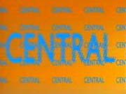 Noise
Noise Party Blower
 Ripple
 Sheepdog
 Shuffle
 Slots
Slots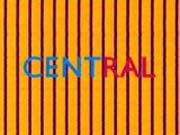 Stripes
 Talking
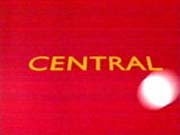 Volleyball
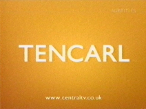 Word Game


